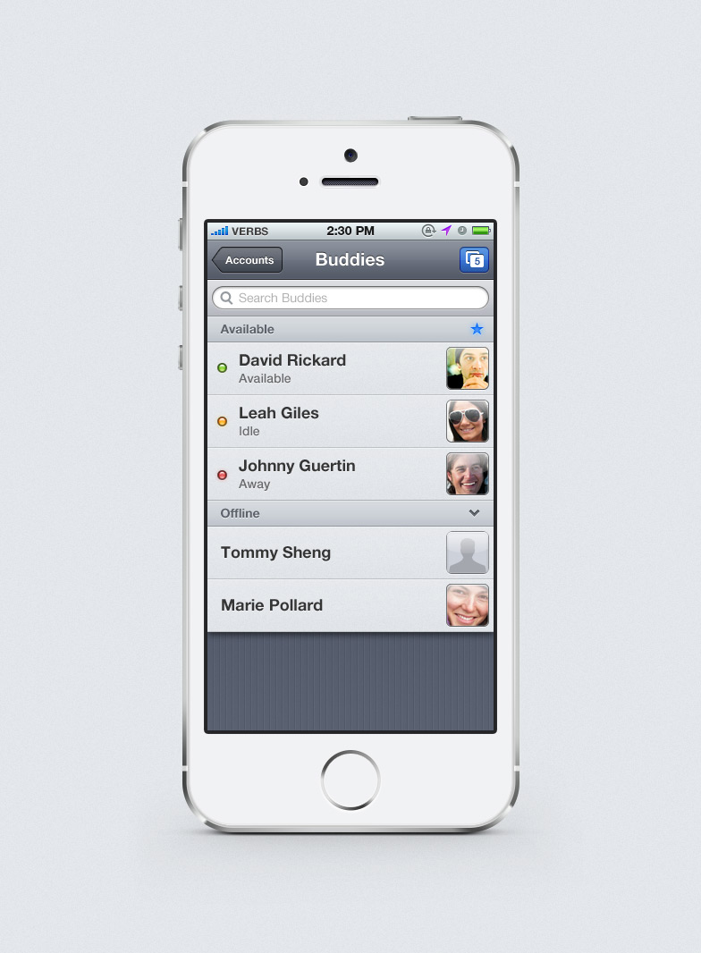
While many instant messaging apps go for the ‘everything but the kitchen sink’ approach, Verbs App went for clean, refined and no-nonsense. The result is a critically acclaimed instant messaging app for both iPhone and iPad.
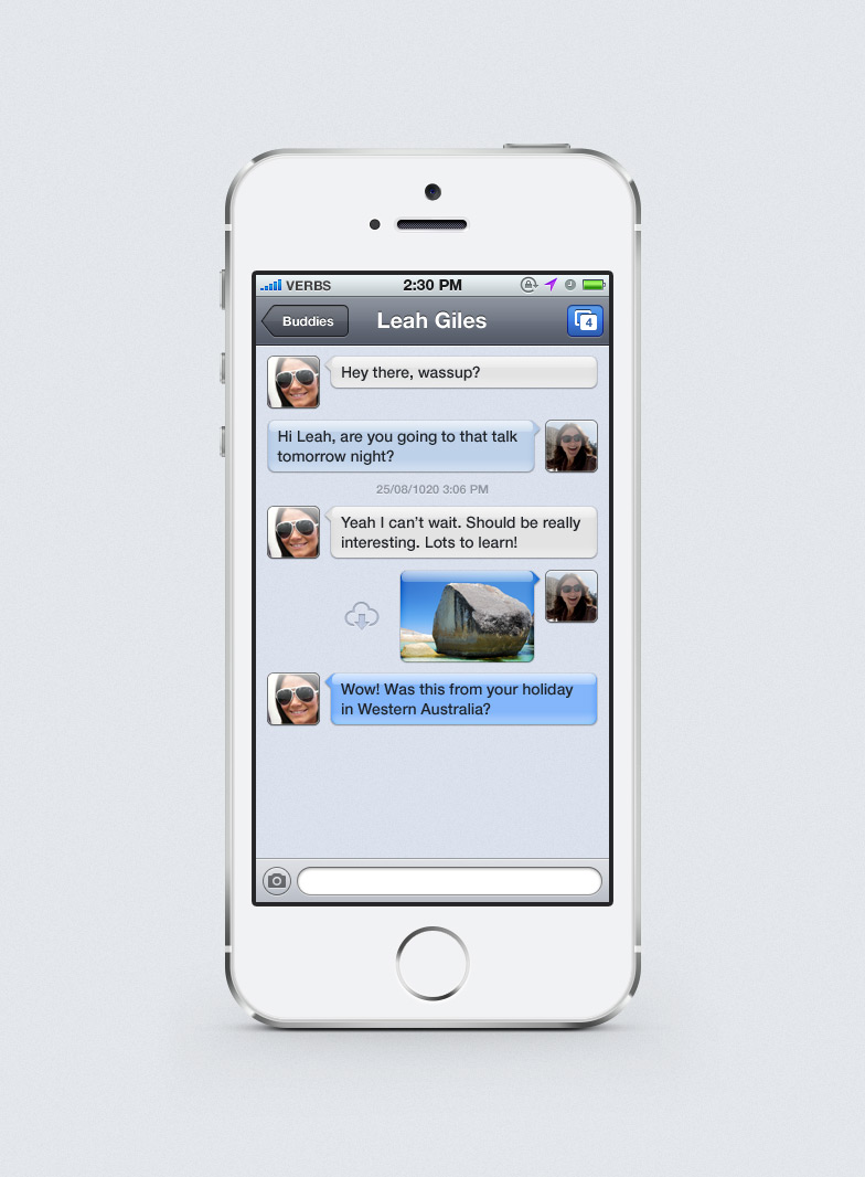
Verbs was designed specifically for iOS. Right from the start we wanted something that felt like a native app, with just enough personality to stand on it’s own. Too many unnecessary features would simply get in the way of what people were trying to do, and that was to simply send short messages to each other.
Changing Conversations
There were two approaches taken for switching between different conversations. The first was a small drawer that would appear underneath the navigation bar, displaying recent conversations as list of avatars with a notification badge for unread messages. The second approach was chosen, zooming out to show each conversation as a page with a live preview of messages. Users could swipe through conversations, jumping in and out quickly and smoothly.
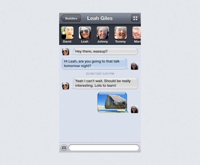
Original concept of a ‘drawer’ that opened between the current conversation and the navigation bar.

Final design of switcher zoomed out of conversations into a page view of current and recent conversations.
Promoting Verbs
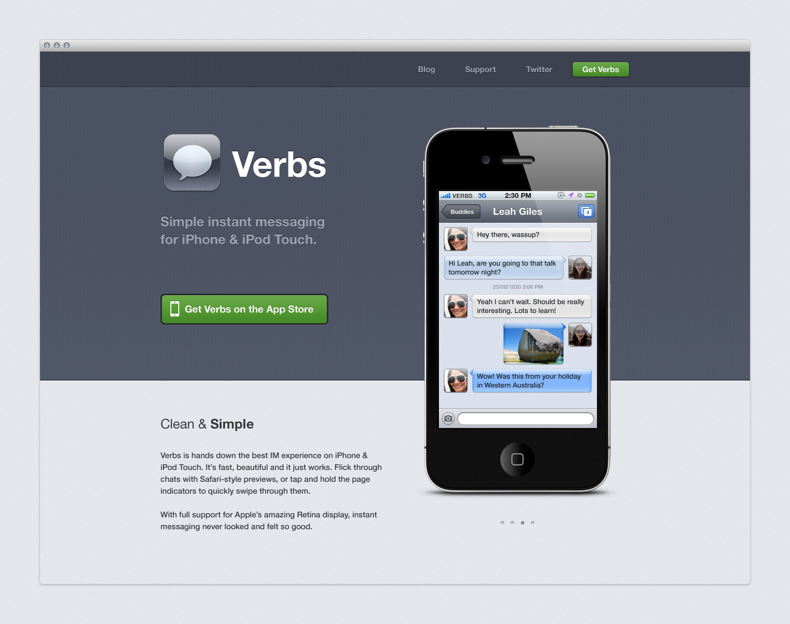
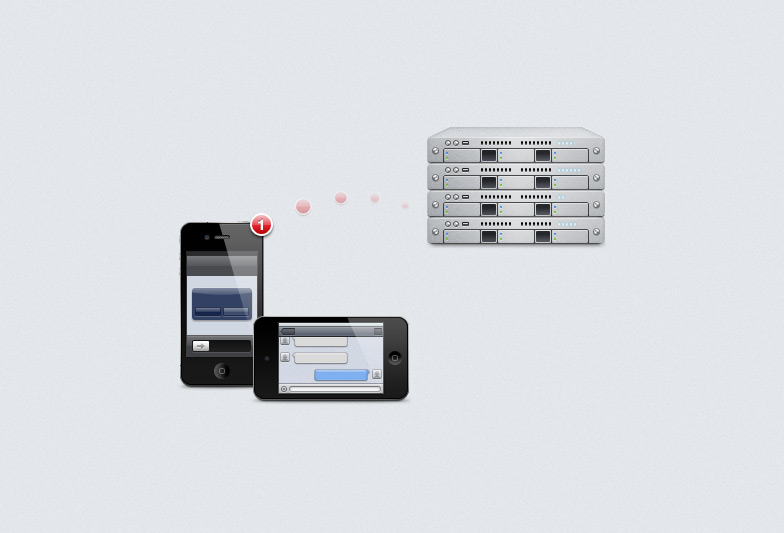
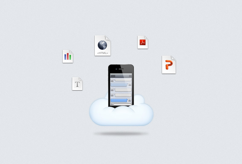
Soon after launch, Apple featured Verbs on the front page of iTunes, meaning a huge spike in downloads for the app. Praise from well-known blogs like Daring Fireball, The Next Web and Gizmodo meant promotion mostly took care of itself. When Verbs 2.0 was launched with a host of new features, I designed and built a website to help explain the benefits of features like push notifications and cloud file storage.
Acclaim for Verbs App
Editor’s Choice
“So much better than AOL’s official AIM client it isn’t even funny.”
“Verbs exemplifies how good a messaging client can look on any platform.”
“The icon is delightful, Verbs looks like it was made for iOS.”
“Verbs features some stunning pixels on every screen.”