It’s ten-to-nine on a Monday morning, and you can’t imagine taking on the rest of the week without your morning coffee. Only you’re running late and the queue at your local café is stretched around the corner. What if you could simply order using your smartphone and pick up your coffee as soon as you arrive? Beat the Q is a service designed to do just that. I was asked to re-design the mobile app, website and vendor administration portal for version 2.0.
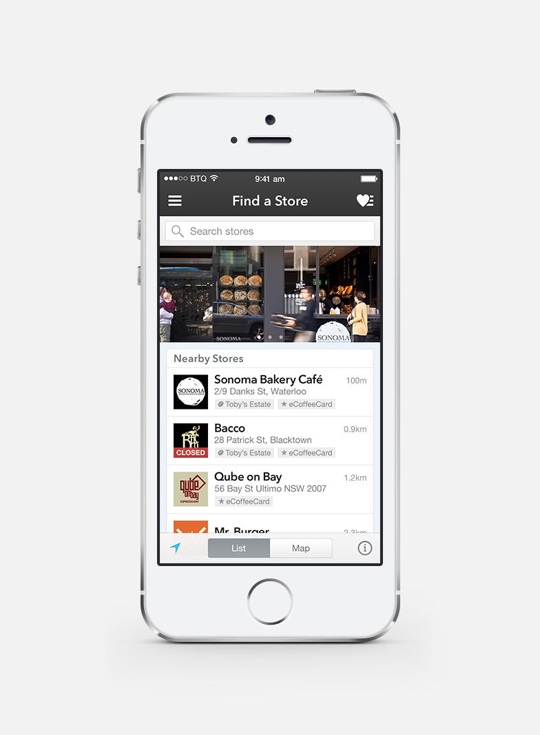
Finding a store is easy. You can search for venues or display them as a list or on a map based on your location.
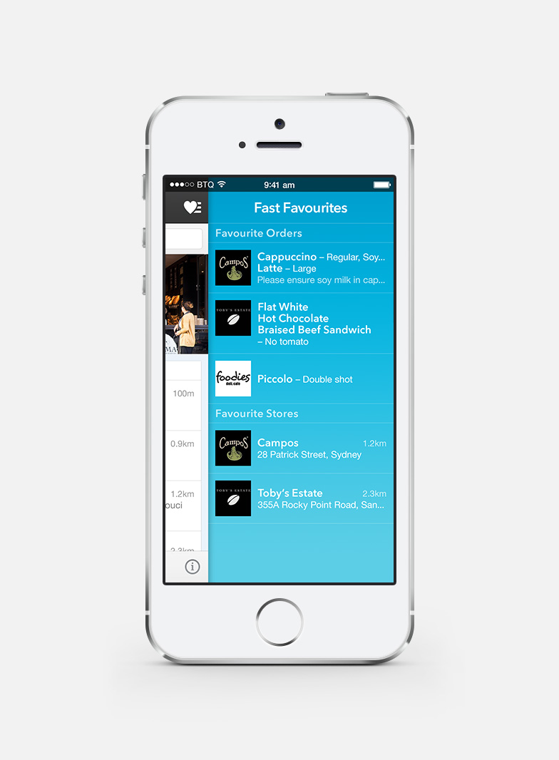
Your favourite orders and stores are only one tap away, appearing via menu that slides in from the side.
Mobile First
Beat the Q is for people on the go, so the mobile app should be the centre of the user experience. It should also be fast: users should get to experience Beat the Q without having to sign up right away. The app launches straight into discovery mode, listing stores closest to you. This is also a plus for vendors, who can attract new customers via featured spots on the discover page or via strong branding and good reviews. An easily accessible favourites menu remembers your most recent and frequent orders, meaning you’re never more than a couple of taps away from that morning espresso. When payment is required, only then are any relevant details requested (a technique known as progressive disclosure).
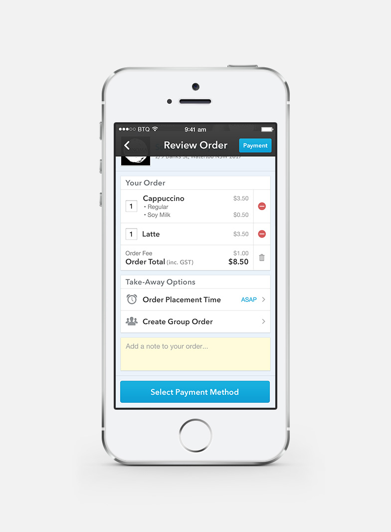
Group orders allow one person to collect items on behalf of several people. Orders can also be timed, so if you want to place an order at 8:15 but pick it up at 8:45, you can.
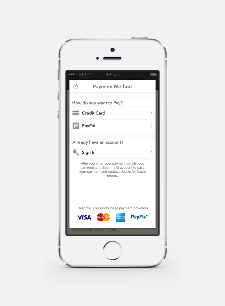
If a new user tries to place an order without providing payment details, a dialog will appear with contextual content.
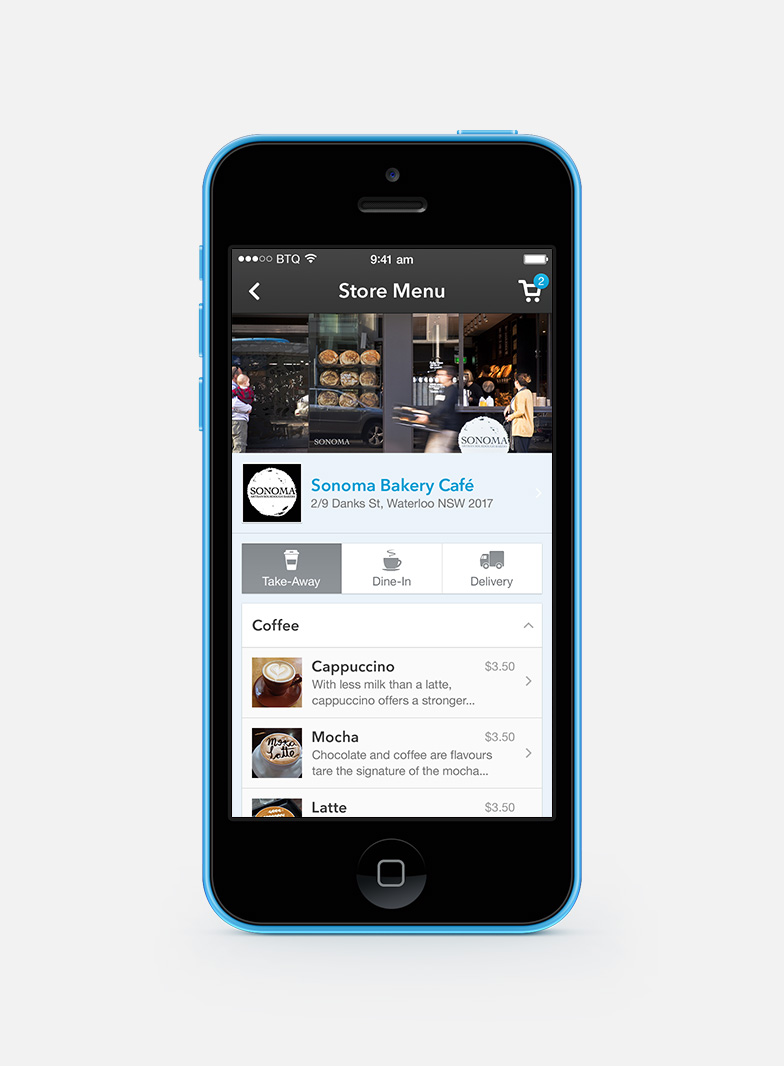
Scroll through the menu, then tap an item to view and add products.
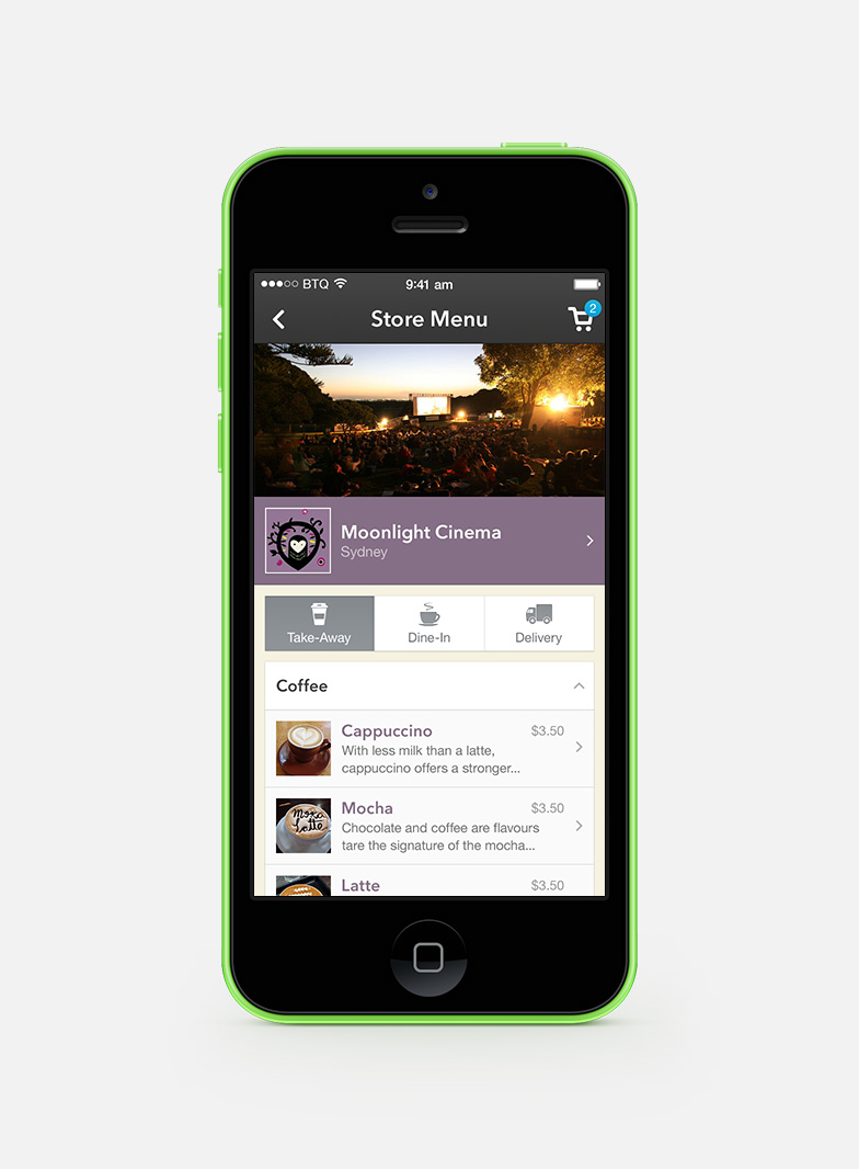
Menus can also be themed to match the store brand.
The Website
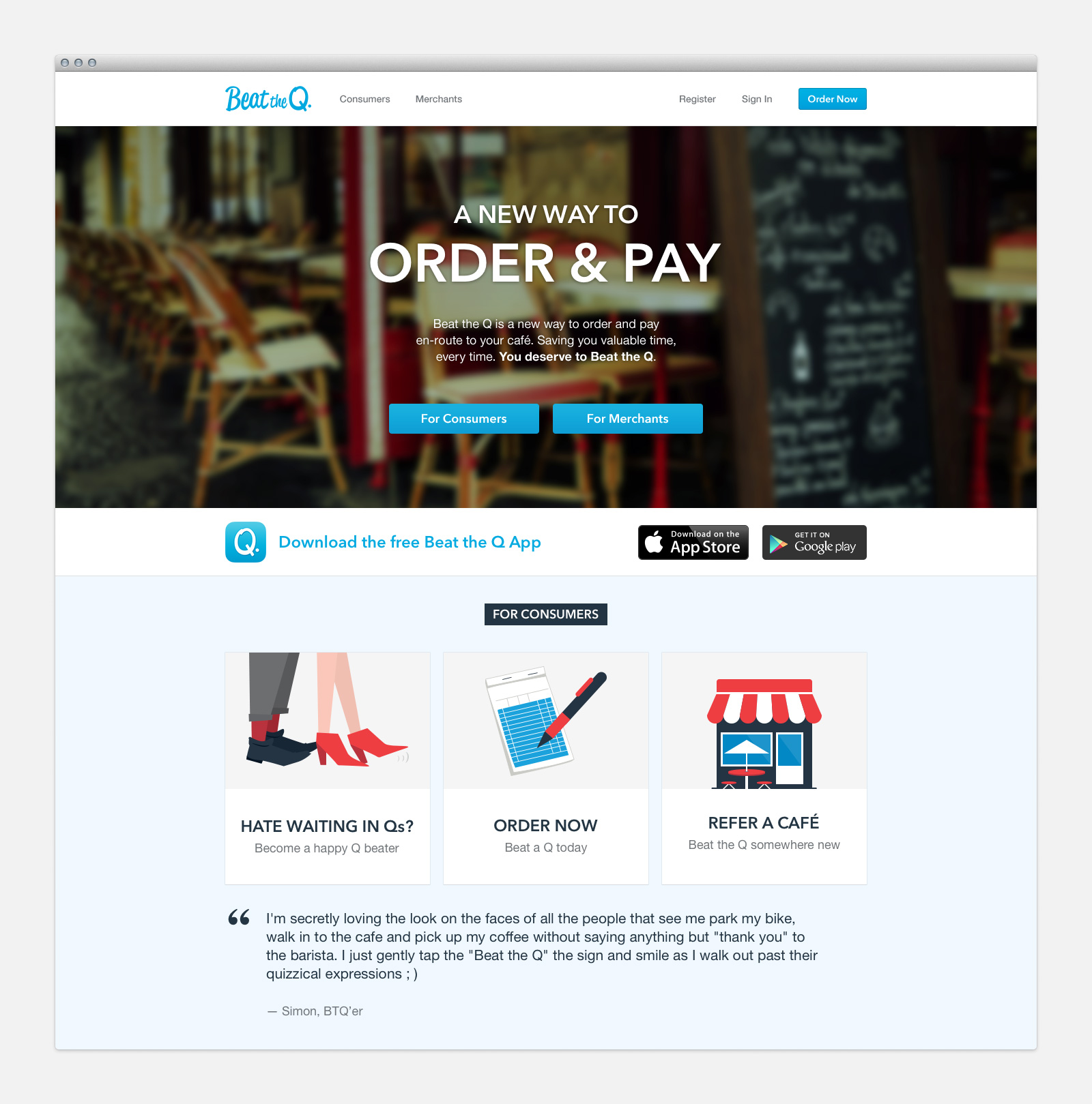
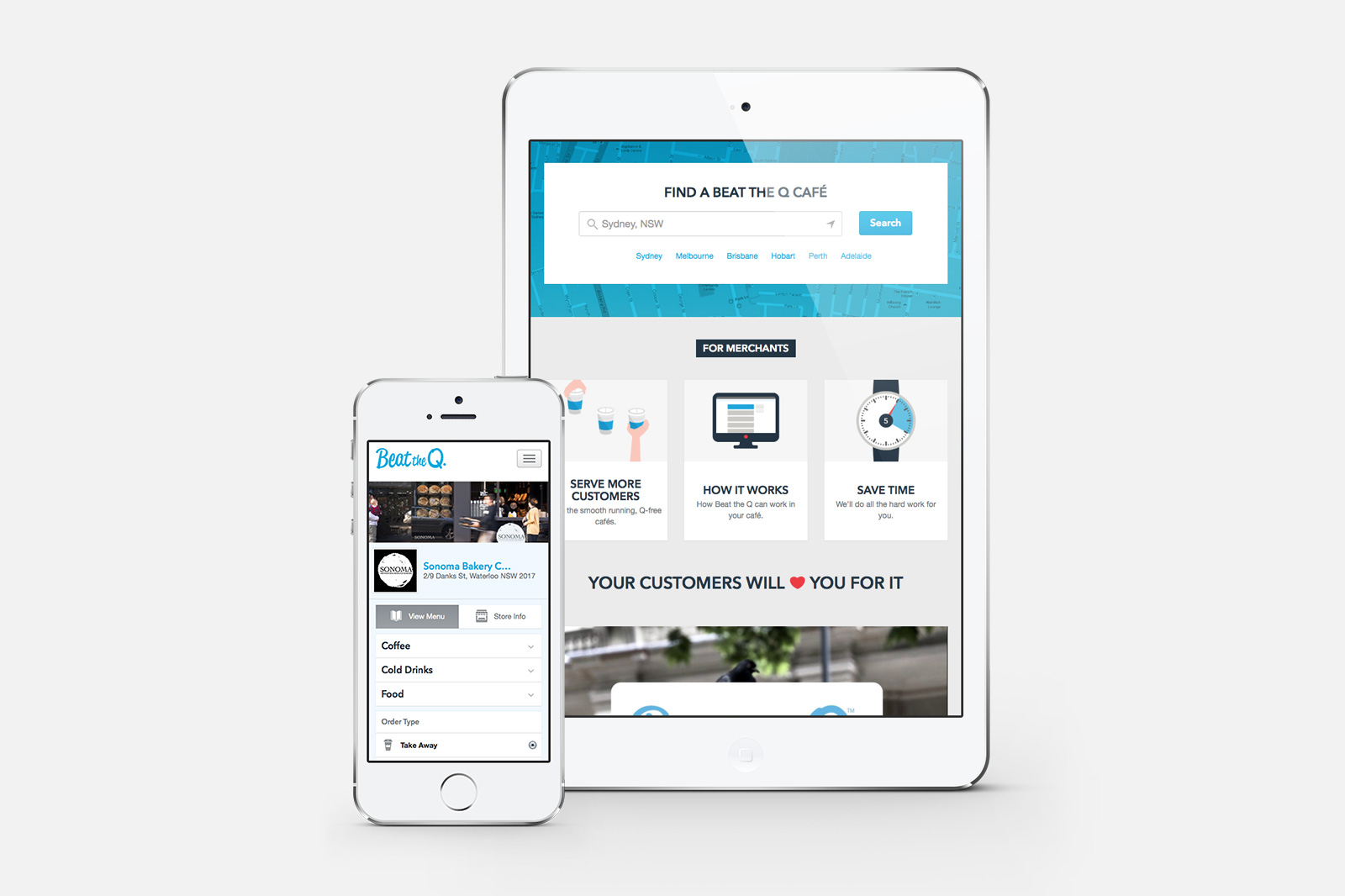
The aim of the Beat the Q website is to introduce the concept to both customers and vendors, and how they can both benefit from the service. All the features of the mobile app – such as ordering and managing your account – are also available on the website, and the responsive design means it works across a number of devices and screen sizes.
Create and Customise
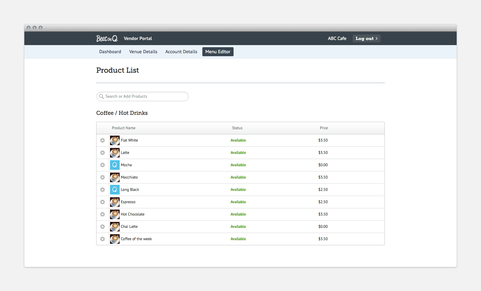
The Vendor Portal allows vendors to create and edit menus, manage their accounts and even customise their store page with photos and colour schemes. I designed and prototyped a powerful menu editor that allows vendors to easily create complex menus with categories and numerous product options.
